This dataset, found in one of my old external drives, corresponds to the famous plot from Radio Observations of the Pulse Profiles and Dispersion Measures of Twelve Pulsars (Craft, 1970).
This is broadly known as the Joy Division’s cover from Unknown Pleasures. If you happen to know whom created the original CSV I used, please let me know so I can give proper credit.
The dataset contains “successive pulses from the first pulsar discovered, CP 1919, are here superimposed vertically. The pulses occur every 1.337 seconds. They are caused by rapidly spinning neutron star.” (The Cambridge Encyclopaedia of Astronomy, 1977)
Thanks to Scientific American, there is a complete explanation of the dataset and its origin.
The contribution I made consists in:
- Easing the access to this very popular dataset.
- Documenting everything and organizing the columns in a clear way (I hope).
A few days ago I wrote about the Tidyverse/Shiny internals, so here I will show how to plot this dataset exactly like the very popular Joy Division t-shirts both with ggplot2 and tinyplot. This is a good way to think more actively rather than resorting on muscular memory at my age and years using R.
Install
From CRAN
install.packages("cp1919")
From GitHub
pak::pkg_install("pachadotdev/cp1919")
Read
library(cp1919)
head(pulsar)
  measurement time radio_intensity
1           1    1           -0.81
2           1    2           -0.91
3           1    3           -1.09
4           1    4           -1.00
5           1    5           -0.59
6           1    6           -0.82
Visualize
Simple plot
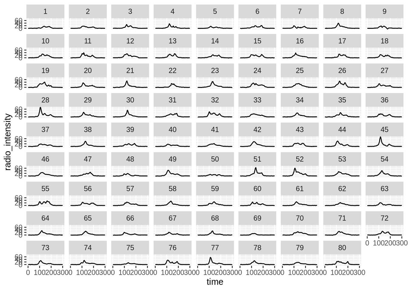
This looks nothing like the Joy Division album cover but it is the starting point.
library(ggplot2)

ggplot(pulsar) +
    geom_line(
        aes(x = time, y = radio_intensity)
    ) +
    facet_wrap(~measurement)
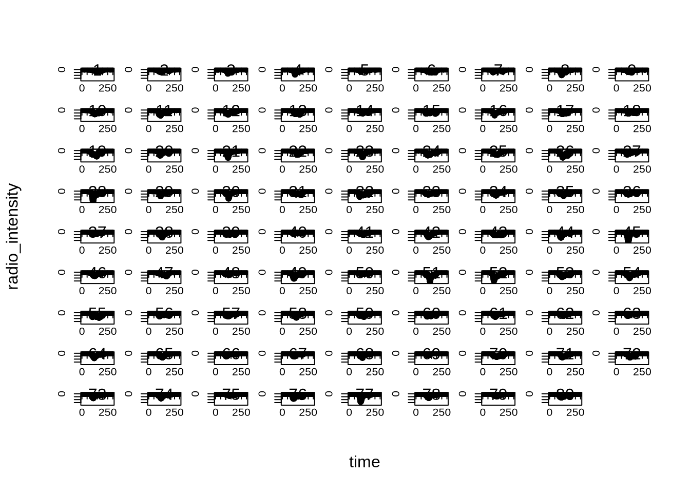
library(tinyplot)

plt(
    radio_intensity ~ time,
    data = pulsar,
    facet = ~measurement
)
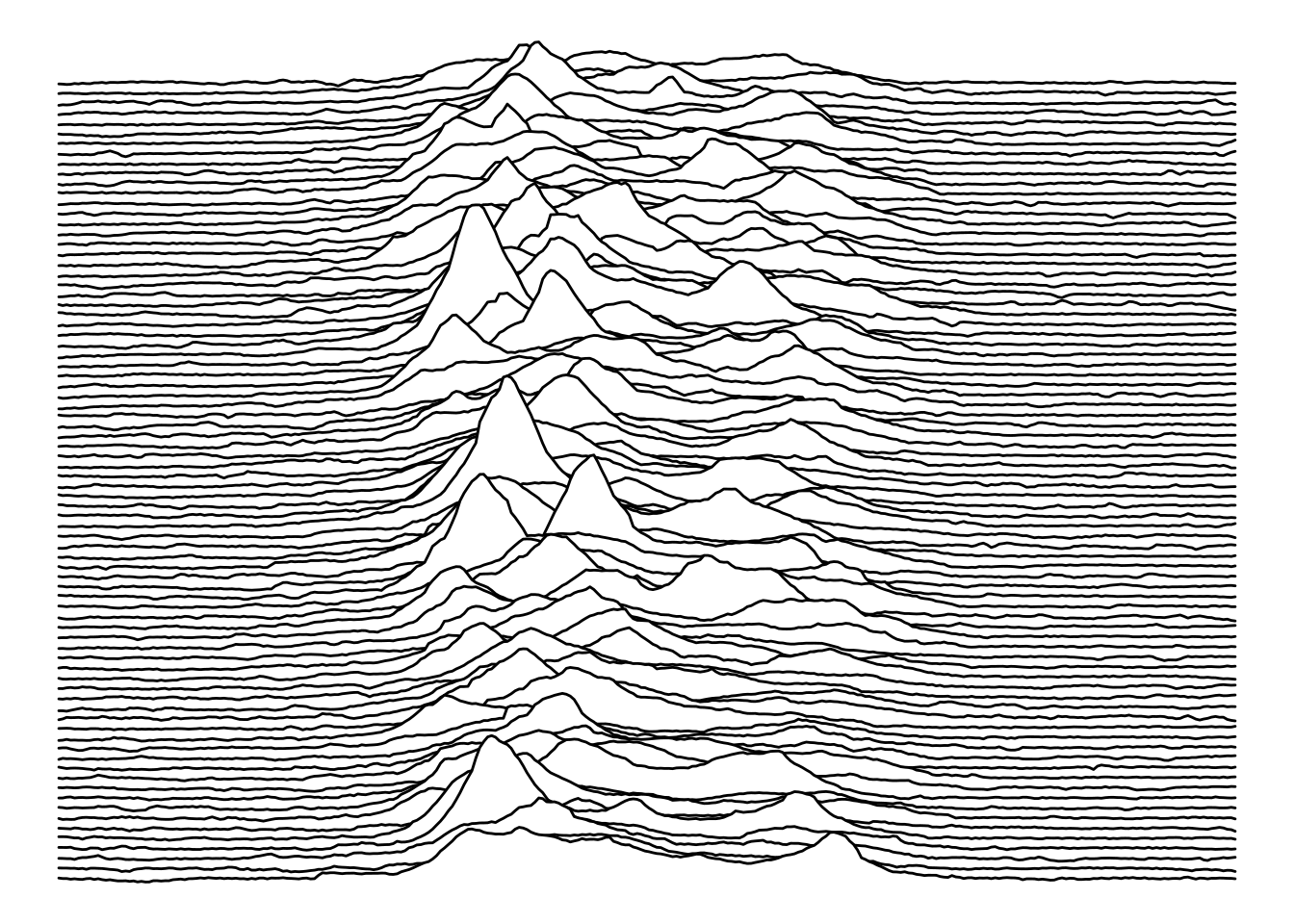
The Cambridge Encyclopaedia of Astronomy (1977)
Now we get a plot with the stacked waves.
With ggplot2 the easy option is to rely on ggridges that does a great job stacking the series.
library(ggridges)

col1 <- "white"
col2 <- "black"

ggplot(pulsar, aes(x = time, y = measurement, height = radio_intensity, group = measurement)) +
  geom_ridgeline(
    min_height = min(pulsar$radio_intensity),
    scale = 0.2,
    linewidth = 0.5,
    fill = col1,
    colour = col2
  ) +
  scale_y_reverse() +
  theme_void() +
  theme(
    panel.background = element_rect(fill = col1),
    plot.background = element_rect(fill = col1, color = col1),
  )
With tinyplot I have to go back one decade to the past and remember base R to adapt from ggridges internals.
pulsar2 <- transform(pulsar, measurement = factor(measurement))
measurements <- sort(unique(pulsar2$measurement))
n <- length(measurements)

# integer baselines: identical to ggridges ymax = y + scale * height
scale_fac <- 0.2  # mirrors geom_ridgeline(scale = 0.2)

pulsar2$y_stacked <- scale_fac * pulsar2$radio_intensity +
    (n - match(pulsar2$measurement, measurements))

par(bg = col1, mar = c(0, 0, 0, 0))

plt(
    y_stacked ~ time | measurement,
    data = pulsar2,
    type = type_area(alpha = 1),
    ylim = range(pulsar2$y_stacked),
    bg = col1,
    col = col2,
    axes = FALSE,
    legend = FALSE,
    frame.plot = FALSE
)
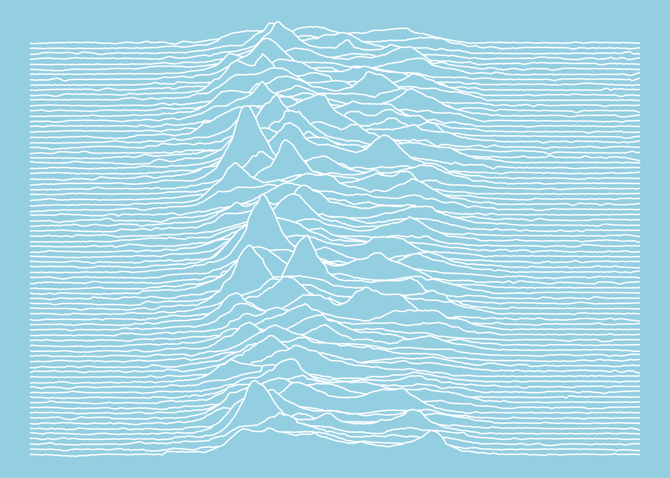
The Nature of Pulsars (Scientific American, 1970)
Similar to the previous plots.
col1 <- "#94cee1"
col2 <- "white"

ggplot(pulsar, aes(x = time, y = measurement, height = radio_intensity, group = measurement)) +
  geom_ridgeline(
    min_height = min(pulsar$radio_intensity),
    scale = 0.2,
    linewidth = 0.5,
    fill = col1,
    colour = col2
  ) +
  scale_y_reverse() +
  theme_void() +
  theme(
    panel.background = element_rect(fill = col1),
    plot.background = element_rect(fill = col1, color = col1),
  )
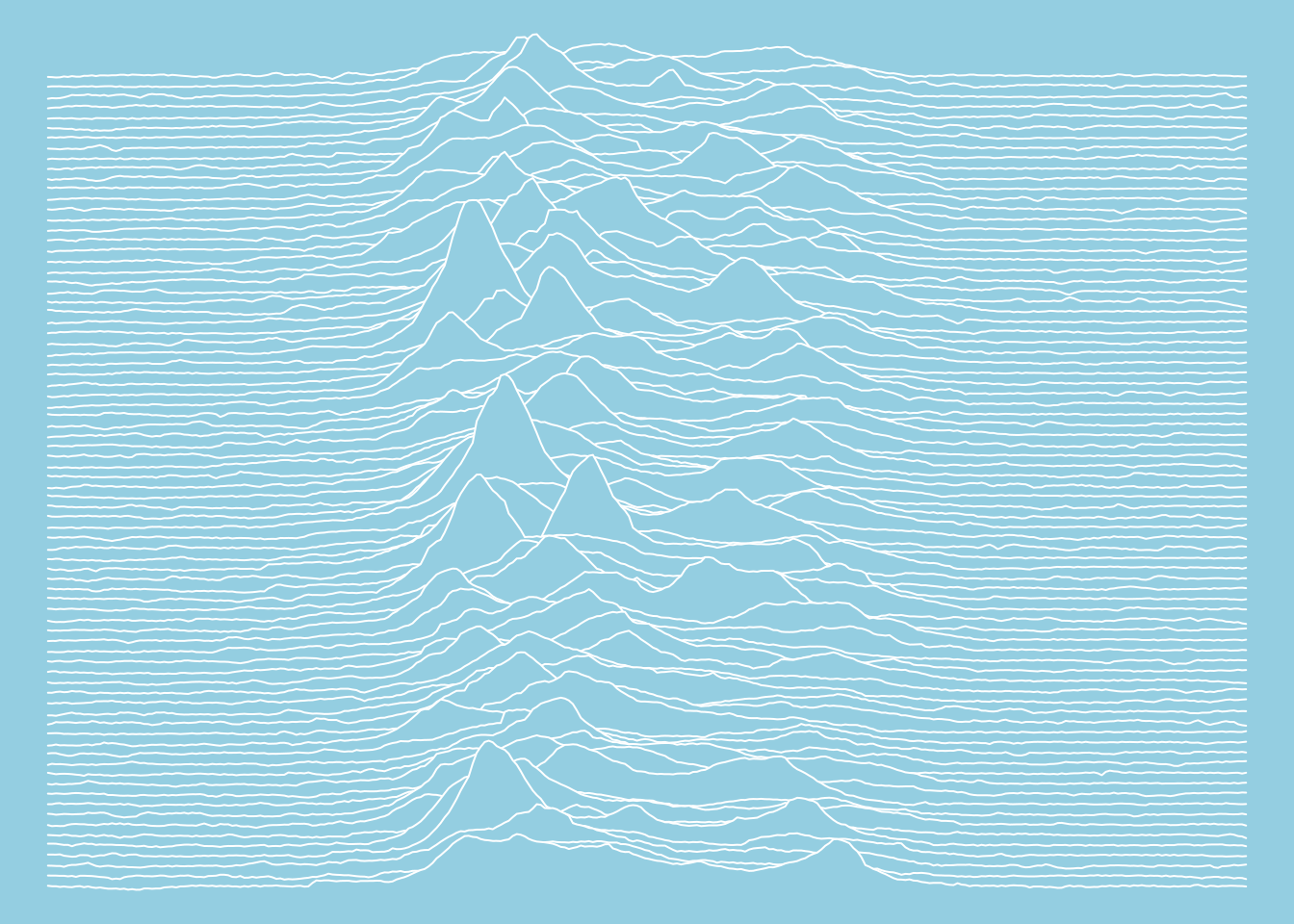
par(bg = col1, mar = c(0, 0, 0, 0))

plt(
    y_stacked ~ time | measurement,
    data = pulsar2,
    type = type_area(alpha = 1),
    ylim = range(pulsar2$y_stacked),
    bg = col1,
    col = col2,
    axes = FALSE,
    legend = FALSE,
    frame.plot = FALSE
)
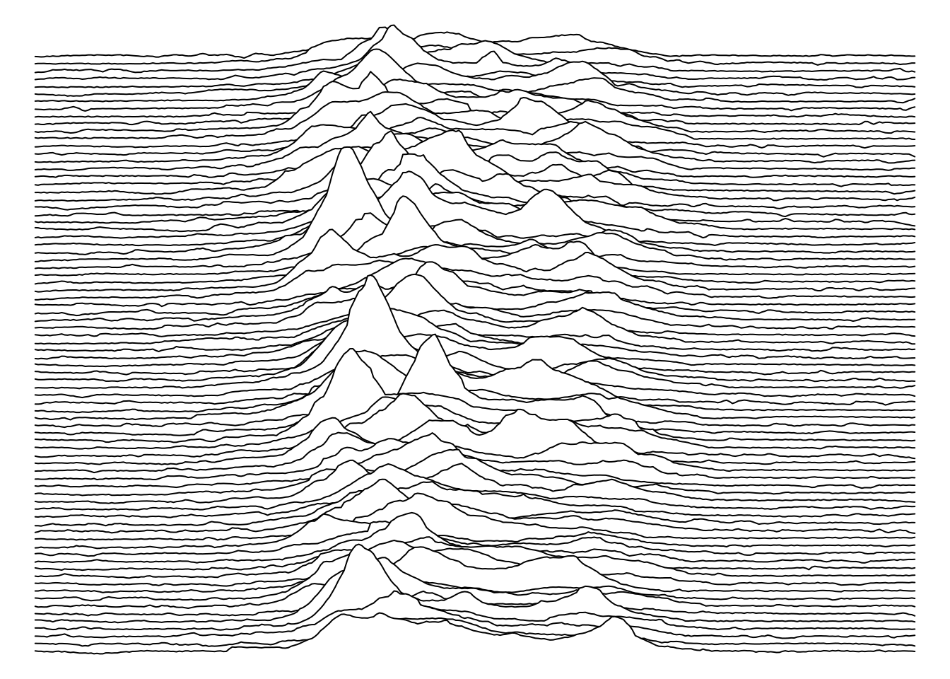
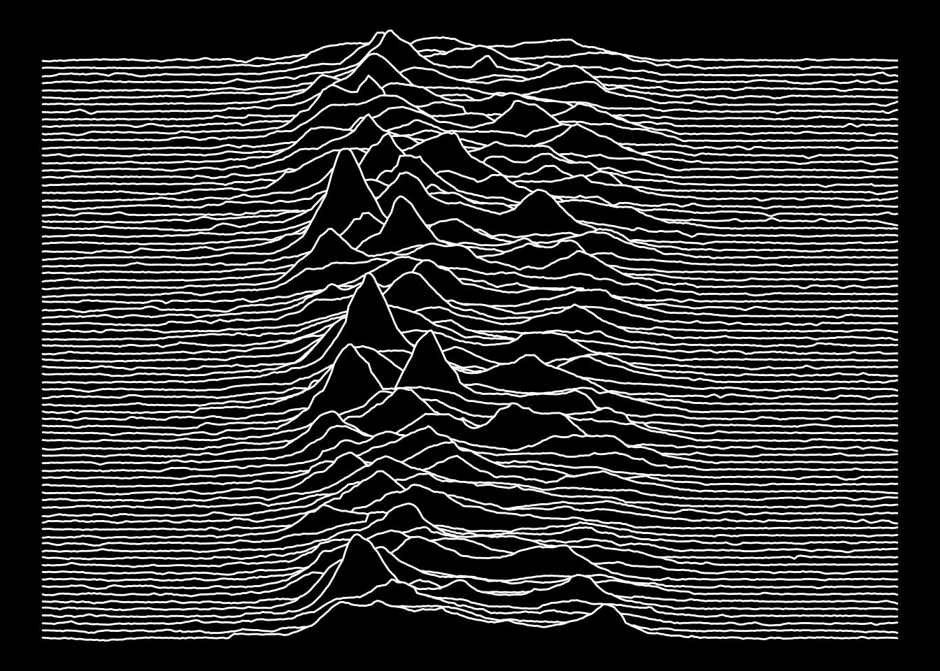
Joy Division’s Unknown Pleasures (1979)
Now we get a plot you can print on a T-Shirt.
col1 <- "black"
col2 <- "white"

ggplot(pulsar, aes(x = time, y = measurement, height = radio_intensity, group = measurement)) +
  geom_ridgeline(
    min_height = min(pulsar$radio_intensity),
    scale = 0.2,
    linewidth = 0.5,
    fill = col1,
    colour = col2
  ) +
  scale_y_reverse() +
  theme_void() +
  theme(
    panel.background = element_rect(fill = col1),
    plot.background = element_rect(fill = col1, color = col1),
  )
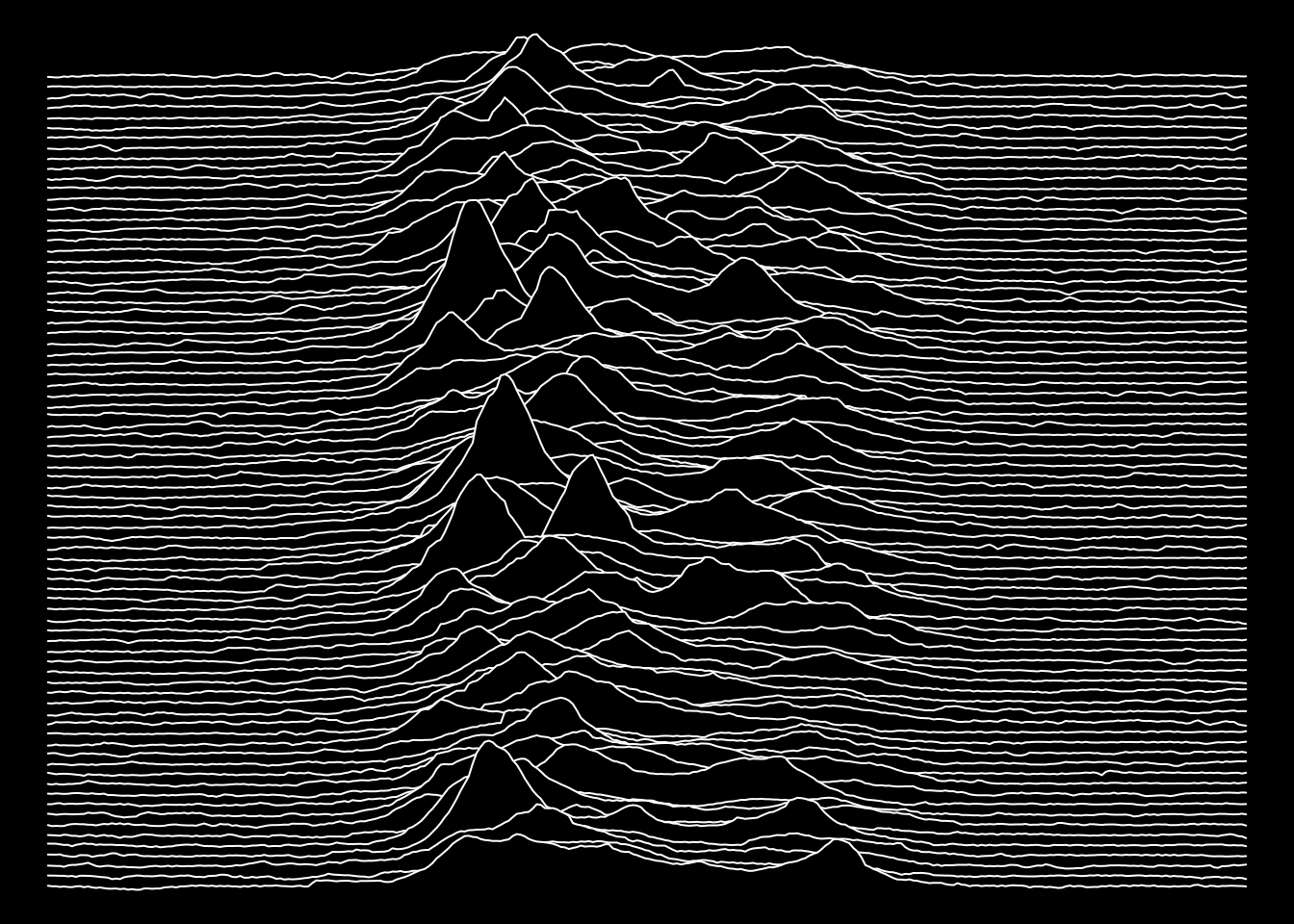
par(bg = col1, mar = c(0, 0, 0, 0))

plt(
    y_stacked ~ time | measurement,
    data = pulsar2,
    type = type_area(alpha = 1),
    ylim = range(pulsar2$y_stacked),
    bg = col1,
    col = col2,
    axes = FALSE,
    legend = FALSE,
    frame.plot = FALSE
)