Updated 2024-05-05: Yet another update by Renger van Nieuwkoop.
Updated 2024-04-10: Renger van Nieuwkoop sent me some improvements to get the plot even closer to the original.
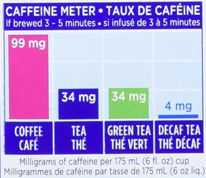
Tetley tea boxes feature the following caffeine meter:
In R we can replicate this meter using ggplot2.
Move the information to a tibble:
library(dplyr)

caffeine_meter <- tibble(
  cup = c("Coffee", "Tea", "Green Tea", "Decaf Tea"),
  caffeine = c(99, 34, 34, 4)
)

caffeine_meter
# A tibble: 4 × 2
  cup       caffeine
  <chr>        <dbl>
1 Coffee          99
2 Tea             34
3 Green Tea       34
4 Decaf Tea        4
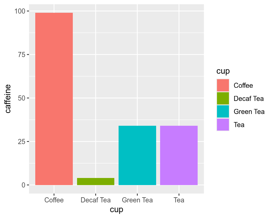
Now we can plot the caffeine meter using ggplot2:
library(ggplot2)

g <- ggplot(caffeine_meter) +
  geom_col(aes(x = cup, y = caffeine, fill = cup))

g
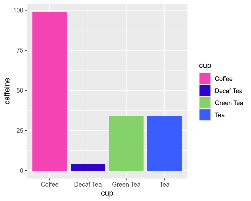
Then I add the colours that I extracted with GIMP:
pal <- c("#f444b3", "#3004c9", "#85d26a", "#3a5dff")

g + scale_fill_manual(values = pal)
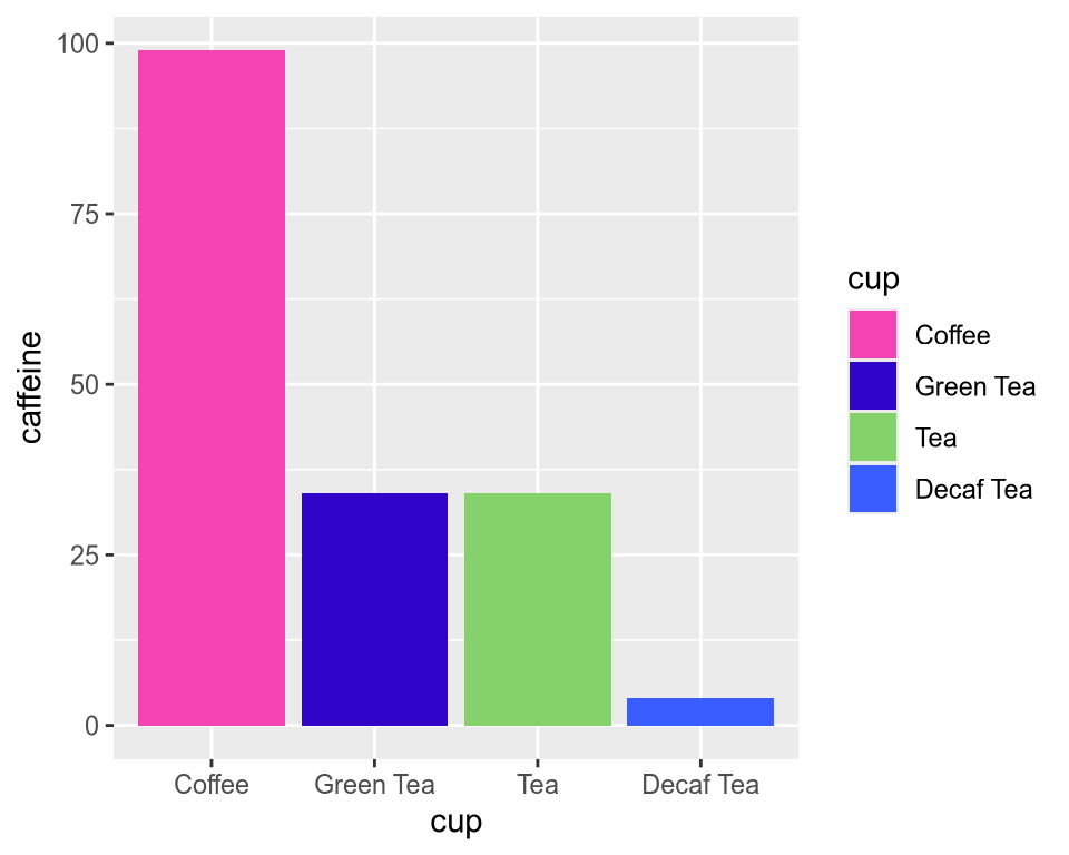
The Decaf Tea category should be at the end of the plot, so I need to transform the “cup” column to a factor sorted decreasingly by the “caffeine” column:
library(forcats)

caffeine_meter <- caffeine_meter %>%
  mutate(cup = fct_reorder(cup, -caffeine))

g <- ggplot(caffeine_meter) +
  geom_col(aes(x = cup, y = caffeine, fill = cup)) +
  scale_fill_manual(values = pal)

g
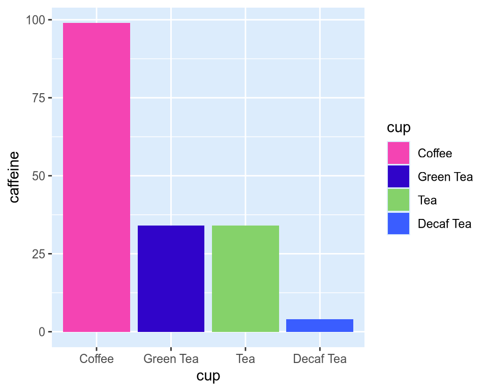
Now I can change the background colour to a more blueish gray:
g +
  theme(panel.background = element_rect(fill = "#dcecfc"))
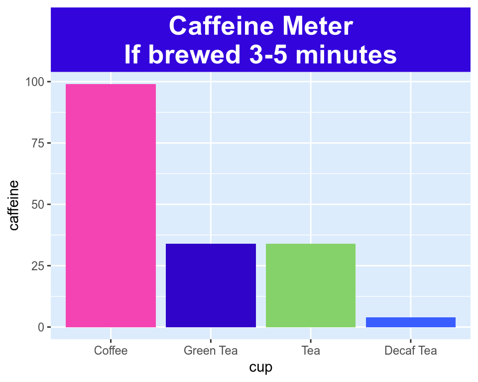
Now I need to add the title with a blue background, so putting all together:
caffeine_meter <- caffeine_meter %>%
  mutate(title = "Caffeine Meter\nIf brewed 3-5 minutes")

ggplot(caffeine_meter) +
  geom_col(aes(x = cup, y = caffeine, fill = cup)) +
  scale_fill_manual(values = pal) +
  facet_grid(. ~ title) +
  theme(
    strip.background = element_rect(fill = "#3304dc"),
    strip.text = element_text(size = 20, colour = "white", face = "bold"),
    panel.background = element_rect(fill = "#dcecfc"),
    legend.position = "none"
  )
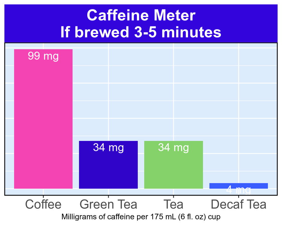
Renger van Nieuwkoop sent me these improvements to get it even closer to the original, where I made some changes to avoid deprecation warnings:
caffeine_meter <- caffeine_meter %>%
  mutate(title = "Caffeine Meter\nIf brewed 3-5 minutes") %>%
  mutate(labelx = paste0(caffeine, " mg"))

ggplot(caffeine_meter) +
  geom_col(aes(x = cup, y = caffeine, fill = cup)) +
  scale_fill_manual(values = pal) +
  geom_text(aes(x = cup, y = caffeine, label = labelx),
    color = "white",
    size = 5, hjust = 0.5, vjust = 1.3, position = "stack"
  ) +
  facet_grid(. ~ title) +
  theme(
    strip.background = element_rect(fill = "#3304dc"),
    strip.text = element_text(size = 20, colour = "white", face = "bold"),
    panel.background = element_rect(fill = "#dcecfc"),
    legend.position = "none",
    axis.title.y = element_blank(),
    axis.text.y = element_blank(),
    axis.ticks.y = element_blank(),
    axis.title.x = element_text(size = 10),
    axis.text.x = element_text(size = 16),
    panel.border = element_rect(colour = "black", fill = NA, linewidth = 1)
  ) +
  ylab("") +
  xlab("Milligrams of caffeine per 175 mL (6 fl. oz) cup")
Even closer to the original! 🎉
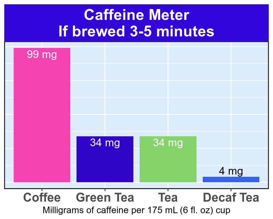
ggplot(caffeine_meter) +
  geom_col(aes(x = cup, y = caffeine, fill = cup)) +
  scale_fill_manual(values = pal) +
  geom_text(aes(x = cup, y = caffeine, label = labelx),
    color = c("white", "white", "white", "black"),
    size = 5, hjust = 0.5, vjust = c(1.3, 1.3, 1.3, -0.3),
    position = "stack"
  ) +
  facet_grid(. ~ title) +
  theme(
    strip.background = element_rect(fill = "#3304dc"),
    strip.text = element_text(size = 20, colour = "white", face = "bold"),
    panel.background = element_rect(fill = "#dcecfc"),
    legend.position = "none",
    axis.title.y = element_blank(),
    axis.text.y = element_blank(),
    axis.ticks.y = element_blank(),
    axis.title.x = element_text(size = 12),
    axis.text.x = element_text(size = 16, face = "bold"),
    panel.border = element_rect(colour = "black", fill = NA, linewidth = 1)
  ) +
  ylab("") +
  xlab("Milligrams of caffeine per 175 mL (6 fl. oz) cup")