library(ggplot2)
library(canadamaps)

ggplot(data = census_divisions) +
  geom_sf(aes(geometry = geometry)) +
  labs(title = "Canada's Census Divisions")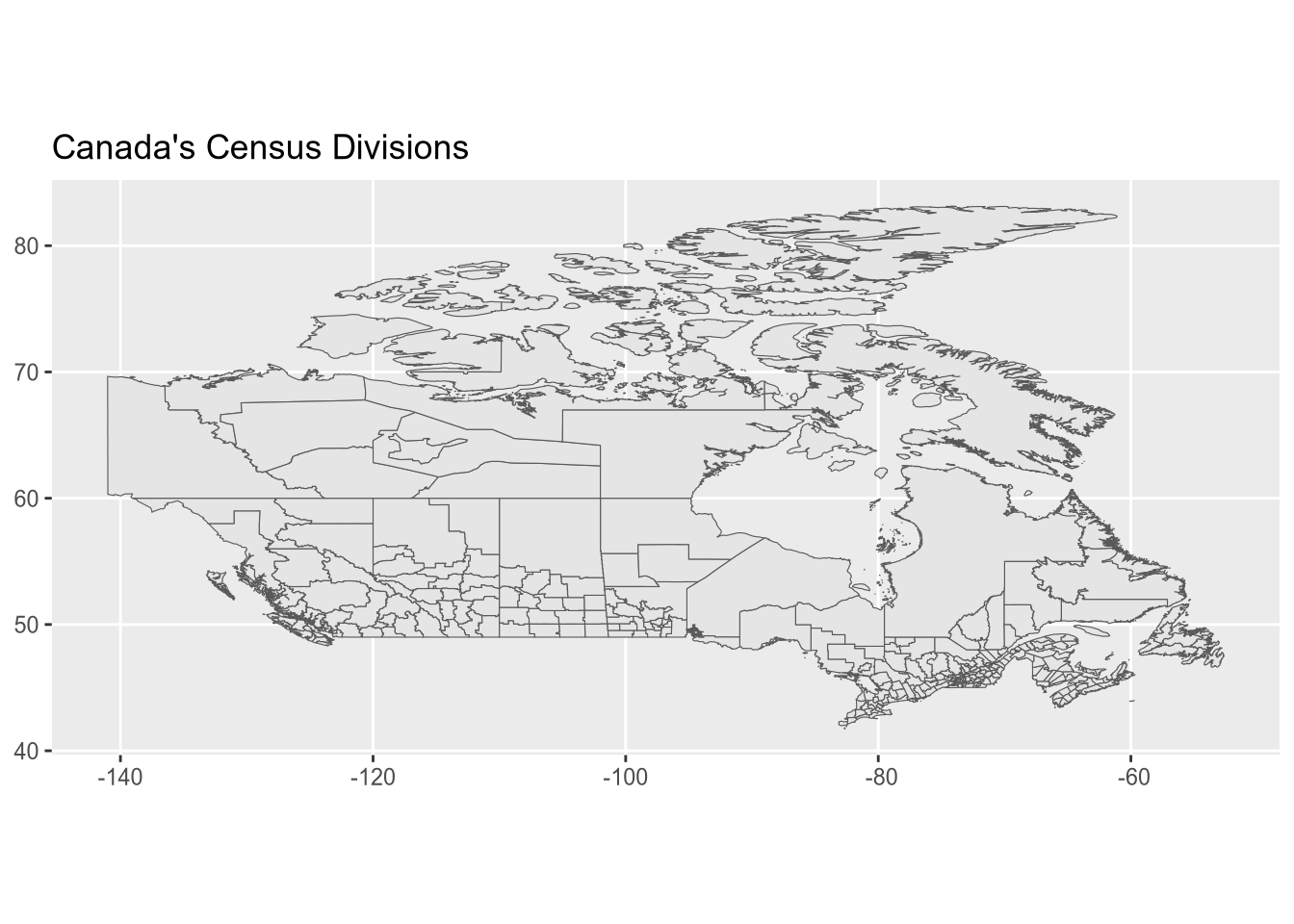
The creation of Canadamaps is deeply rooted in a journey from adversity to contribution. Following a challenging period marked by the “social explosion” in Chile, which led to multiple casualties, wounded people, the destruction of my neighborhood, along with multiple arson attacks that destroyed subway stations, churches, supermarkets, and public libraries, I relocated to Canada in search of peace and stability.
This transition not only offered me a serene environment but also started a journey where I engaged with the Canadian culture. My work on Canadamaps, alongside contributions to other R packages like pointblank, is driven by a desire to give back to the country that welcomed me.
The latest update, version 0.3.0, exemplifies our commitment to accessibility and user-friendliness by streamlining dependencies and simplifying the installation process, reflecting my mission to provide a public good that can help others.
The idea is to avoid “duplications”, for example instead of adding a provinces map or others, we provide functions to sum Census Divisions in all possible cases.
library(ggplot2)
library(canadamaps)
ggplot(data = census_divisions) +
geom_sf(aes(geometry = geometry)) +
labs(title = "Canada's Census Divisions")
The same idea can be applied to other maps with different levels of aggregation.
ggplot(data = get_agricultural_divisions()) +
  geom_sf(aes(geometry = geometry)) +
  labs(title = "Canada's Census Agricultural Regions")

ggplot(data = get_economic_regions()) +
  geom_sf(aes(geometry = geometry)) +
  labs(title = "Canada's Economic Regions")

ggplot(data = federal_electoral_districts) +
  geom_sf(aes(geometry = geometry)) +
  labs(title = "Canada's Federal Electoral Districts")

ggplot(data = get_provinces()) +
  geom_sf(aes(geometry = geometry)) +
labs(title = "Canada's Provinces")We can change the CRS with the sf package but please read the explanation from Stats Canada.
# shortcut function to change the CRS
census_divisions <- lambert_projection(census_divisions)

ggplot(data = census_divisions) +
  geom_sf(aes(geometry = geometry)) +
  labs(title = "Canada's Census Divisions")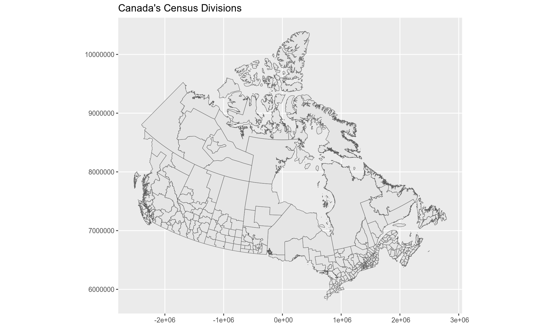
Let’s say I want to replicate the map from Health Canada, which was checked on 2023-08-02 and was updated up to 2024-02-25. To do this, I need to download the CSV file from Health Canada and then combine it with the provinces map from canadamaps.
library(readr)
library(dplyr)
library(sf)

url <- "https://health-infobase.canada.ca/src/data/covidLive/vaccination-coverage-map.csv"
csv <- gsub(".*/", "", url)
if (!file.exists(csv)) download.file(url, csv)

vaccination <- read_csv(csv, col_types = cols(prop5plus_atleast1dose = col_character())) %>%
  filter(week_end == as.Date("2024-02-25"), pruid != 1) %>%
  select(pruid, proptotal_atleast1dose) %>%
  mutate(
    proptotal_atleast1dose = as.numeric(case_when(
      proptotal_atleast1dose == ">=99" ~ 99,
      TRUE ~ proptotal_atleast1dose
    ))
  )

vaccination <- vaccination %>%
  inner_join(get_provinces(), by = "pruid") %>% # canadamaps in action
  mutate(
    label = paste(gsub(" /.*", "", prname),
      paste0(proptotal_atleast1dose, "%"),
      sep = "\n"
    ),
  )
An initial plot can be done with the following code.
# colours obtained with Chromium's inspector
colours <- c("#efefa2", "#c2e699", "#78c679", "#31a354", "#006837")

ggplot(vaccination) +
  geom_sf(aes(fill = proptotal_atleast1dose, geometry = geometry)) +
  geom_sf_label(aes(label = label, geometry = geometry)) +
  scale_fill_gradientn(colours = colours, name = "Cumulative percent") +
  labs(title = "Cumulative percent of the population who have received at least 1 dose of a COVID-19 vaccine") +
  theme_minimal(base_size = 13)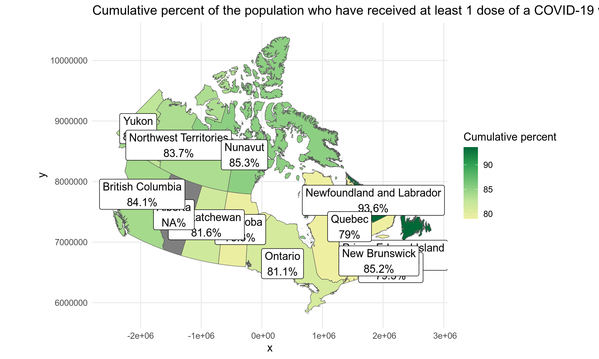
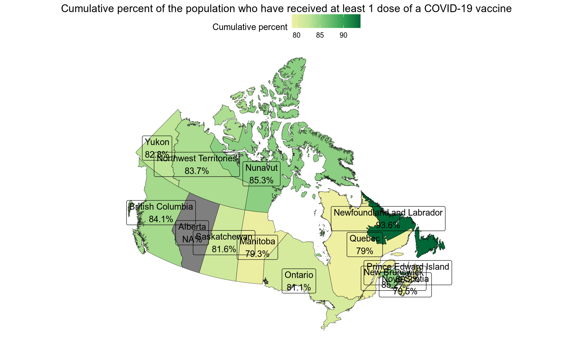
We can use different ggplot themes.
ggplot(vaccination) +
  geom_sf(aes(fill = proptotal_atleast1dose, geometry = geometry)) +
  geom_sf_label(aes(label = label, geometry = geometry)) +
  scale_fill_gradientn(colours = colours, name = "Cumulative percent") +
  labs(title = "Cumulative percent of the population who have received at least 1 dose of a COVID-19 vaccine") +
  theme_void() +
  theme(
    legend.position = "top",
    plot.title = element_text(hjust = 0.5)
  )
If we want to fill the information for Alberta, which is not seen in the original map, we can fill and then filter.
library(tidyr)

vaccination <- read_csv(csv, col_types = cols(prop5plus_atleast1dose = col_character())) %>%
  arrange(pruid, week_end) %>%
  group_by(pruid) %>%
  fill(proptotal_atleast1dose, .direction = "down") %>% # Alberta is filled with an older value
  filter(week_end == as.Date("2024-02-25"), pruid != 1) %>%
  select(pruid, proptotal_atleast1dose) %>%
  mutate(
    proptotal_atleast1dose = as.numeric(case_when(
      proptotal_atleast1dose == ">=99" ~ 99,
      TRUE ~ proptotal_atleast1dose
    ))
  ) %>%
  inner_join(get_provinces(), by = "pruid") %>% # canadamaps in action
  mutate(
    label = paste(gsub(" /.*", "", prname),
      paste0(proptotal_atleast1dose, "%"),
      sep = "\n"
    ),
  ) %>%
  lambert_projection()

ggplot(vaccination) +
  geom_sf(aes(fill = proptotal_atleast1dose, geometry = geometry)) +
  geom_sf_label(aes(label = label, geometry = geometry)) +
  scale_fill_gradientn(colours = colours, name = "Cumulative percent") +
  labs(title = "Cumulative percent of the population who have received at least 1 dose of a COVID-19 vaccine") +
  theme_minimal(base_size = 13)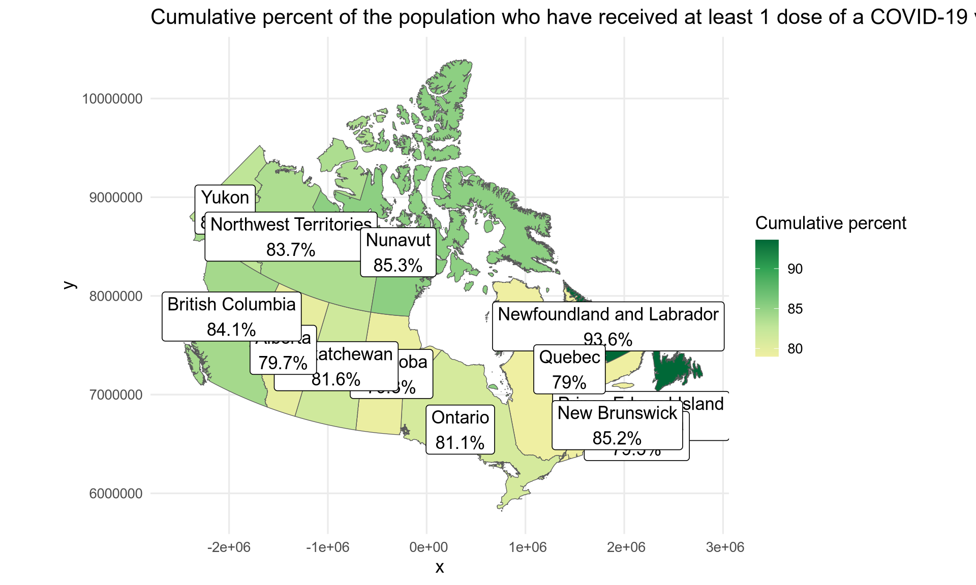
You can install the development version from GitHub with:
# install.packages("remotes")
remotes::install_github("pachadotdev/canadamaps")The package documentation is available at pacha.dev/canadamaps.