R and Shiny Training: If you find this blog to be interesting, please note that I offer personalized and group-based training sessions that may be reserved through Buy me a Coffee. Additionally, I provide training services in the Spanish language and am available to discuss means by which I may contribute to your Shiny project.
Motivation
I had to fix some dependency problems in canadamaps and I also simplified tintin’s usage (the R package, therefore it’s lowercase). I thought it would be good to show an updated example.
Summary
- canadamaps now needs a specific rmapshaper version (0.4.6) to avoid problems with 0.5.0.
- tintin now allows to write palettes’ names in almost any way (i.e., as “the_palette”, “the palette” or “ThE PaLEttE”).
Combined example
This is an adapted example from canadamaps’ readme.
We start by loading the required packages.
if (!require(readr)) install.packages("readr")
if (!require(dplyr)) install.packages("dplyr")
if (!require(ggplot2)) install.packages("ggplot2")
if (!require(sf)) install.packages("sf")
if (!require(tintin)) install.packages("tintin")
if (!require(remotes)) install.packages("remotes")
if (!require(canadamaps)) remotes::install_github("pachadotdev/canadamaps")
── R CMD build ─────────────────────────────────────────────────────────────────
* checking for file ‘/tmp/Rtmp9ouzCa/remotes1ba35c42710fae/pachadotdev-canadamaps-d537400/DESCRIPTION’ ... OK
* preparing ‘canadamaps’:
* checking DESCRIPTION meta-information ... OK
* checking for LF line-endings in source and make files and shell scripts
* checking for empty or unneeded directories
* building ‘canadamaps_0.3.0.tar.gz’
library(readr)
library(dplyr)
library(ggplot2)
library(sf)
library(tintin)
library(canadamaps)
Let’s say I want to replicate the map from Health Canada, which was checked on 2023-08-02 and was updated up to 2023-06-18. To do this, I need to download the CSV file from Health Canada and then combine it with the provinces map from canadamaps.
url <- "https://health-infobase.canada.ca/src/data/covidLive/vaccination-coverage-map.csv"
csv <- gsub(".*/", "", url)
if (!file.exists(csv)) download.file(url, csv)

vaccination <- read_csv(csv) %>%
  filter(week_end == as.Date("2023-06-18"), pruid != 1) %>%
  select(pruid, proptotal_atleast1dose)

vaccination <- vaccination %>%
  left_join(get_provinces(), by = "pruid") %>% # canadamaps in action
  mutate(
    label = paste(gsub(" /.*", "", prname),
                  paste0(proptotal_atleast1dose, "%"), sep = "\n"),
  )
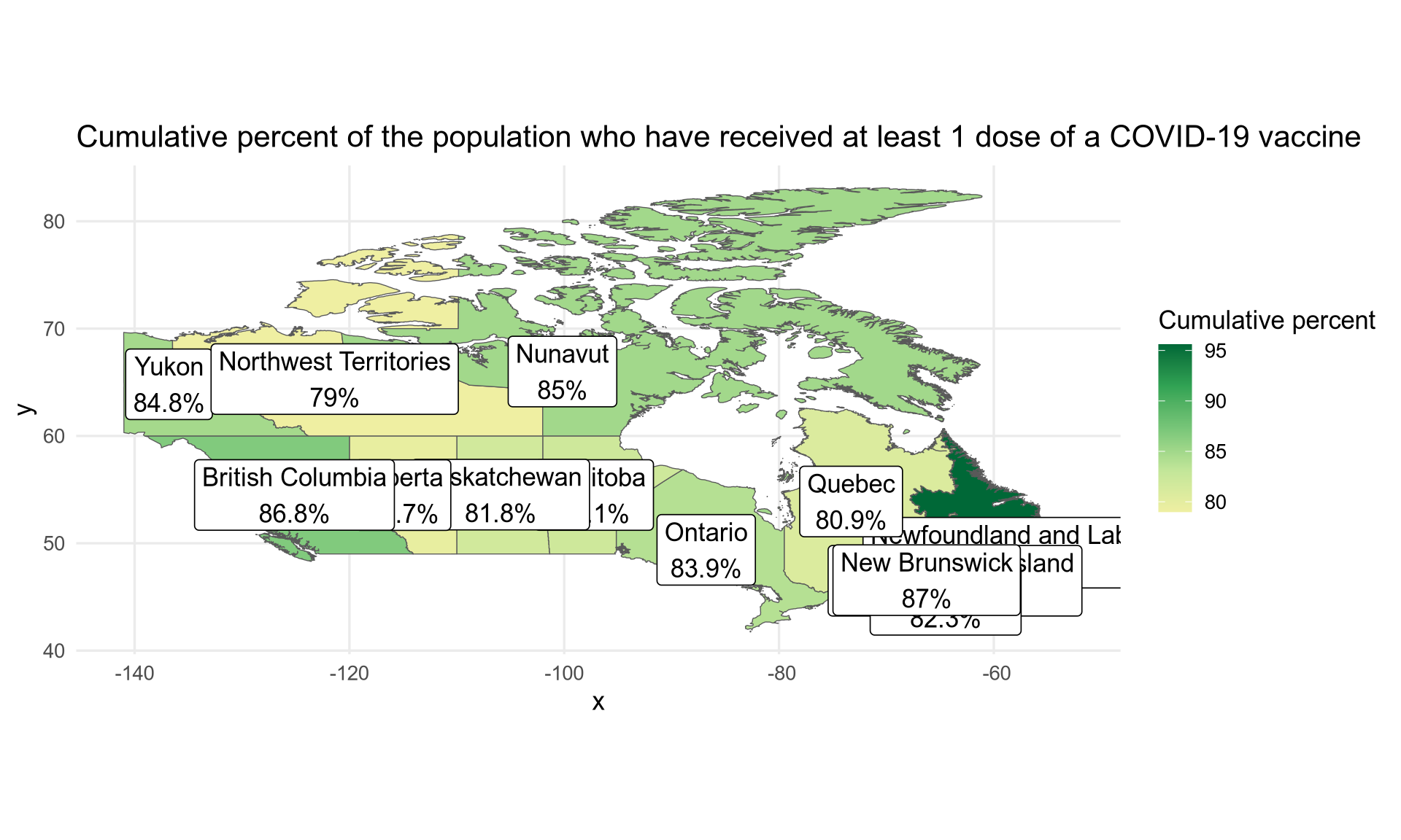
An initial plot can be done with the following code.
# colours obtained with Chromium's inspector
colours <- c("#efefa2", "#c2e699", "#78c679", "#31a354", "#006837")

ggplot(vaccination) +
  geom_sf(aes(fill = proptotal_atleast1dose, geometry = geometry)) +
  geom_sf_label(aes(label = label, geometry = geometry)) +
  scale_fill_gradientn(colours = colours, name = "Cumulative percent") +
  labs(title = "Cumulative percent of the population who have received at least 1 dose of a COVID-19 vaccine") +
  theme_minimal(base_size = 13)
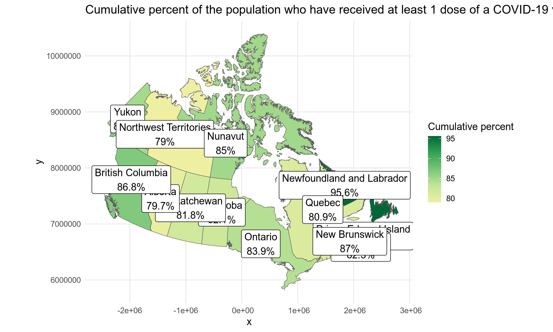
What if we want a Lambert (conic) projection? We can change the CRS with the sf package but please read the explanation from Stats Canada.
vaccination$geometry <- st_transform(vaccination$geometry,
  crs = "+proj=lcc +lat_1=49 +lat_2=77 +lon_0=-91.52 +x_0=0 +y_0=0 +datum=NAD83 +units=m +no_defs")

ggplot(vaccination) +
  geom_sf(aes(fill = proptotal_atleast1dose, geometry = geometry)) +
  geom_sf_label(aes(label = label, geometry = geometry)) +
  scale_fill_gradientn(colours = colours, name = "Cumulative percent") +
  labs(title = "Cumulative percent of the population who have received at least 1 dose of a COVID-19 vaccine") +
  theme_minimal(base_size = 13)
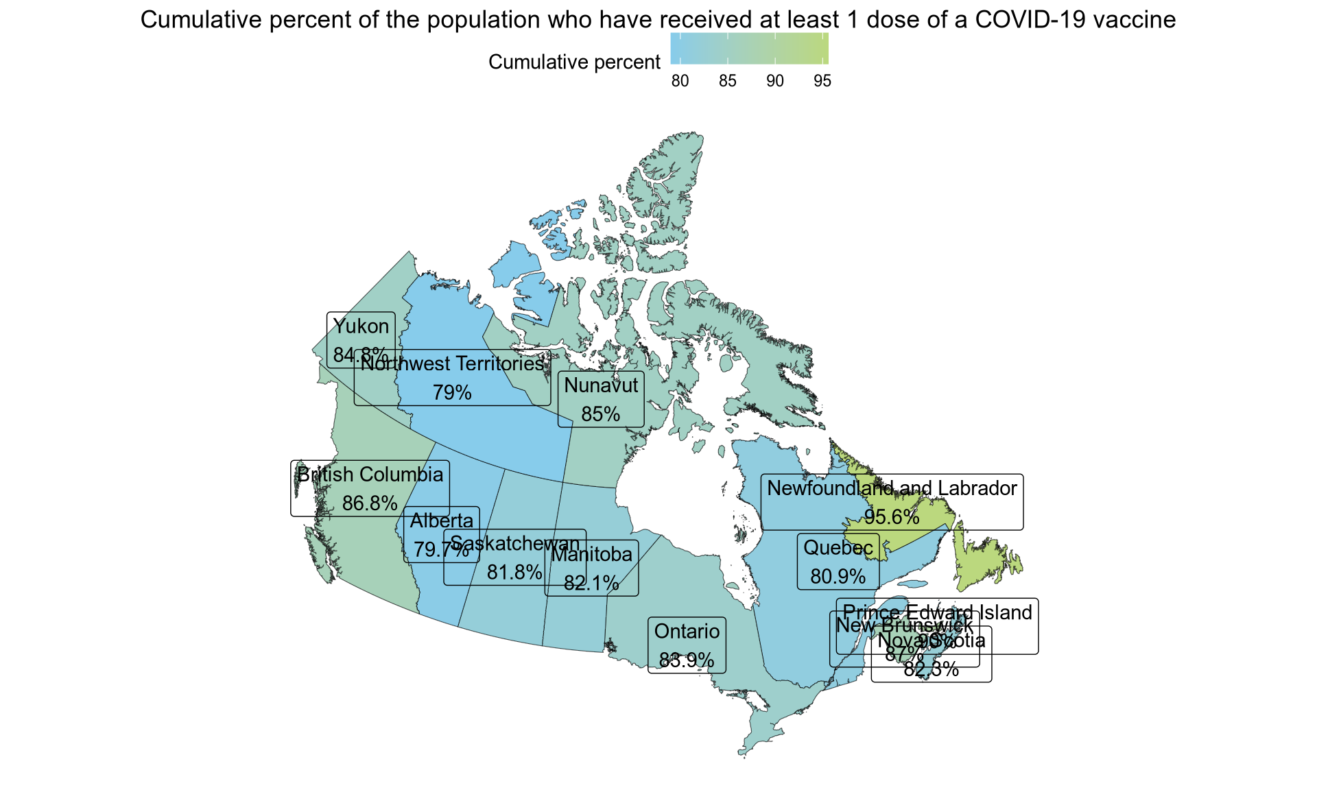
Finally, we can use a different colour scale, in this case the one from “Tintin in America” and a different ggplot theme.
colours <- tintin_clrs(option = "tintin in america")[1:2]

ggplot(vaccination) +
  geom_sf(aes(fill = proptotal_atleast1dose, geometry = geometry)) +
  geom_sf_label(aes(label = label, geometry = geometry)) +
  scale_fill_gradientn(colours = colours, name = "Cumulative percent") +
  labs(title = "Cumulative percent of the population who have received at least 1 dose of a COVID-19 vaccine") +
  theme_void() +
  theme(
    legend.position = "top",
    plot.title = element_text(hjust = 0.5)
  )