R and Shiny Training: If you find this blog to be interesting, please note that I offer personalized and group-based training sessions that may be reserved through Buy me a Coffee. Additionally, I provide training services in the Spanish language and am available to discuss means by which I may contribute to your Shiny project.
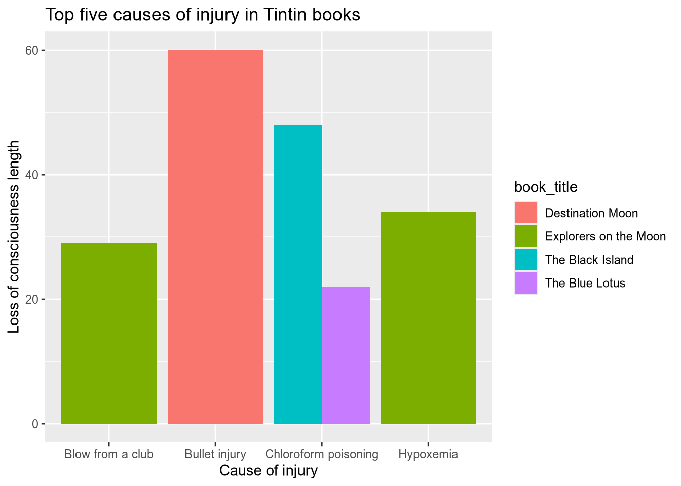
If you have used ggplot2, you probably wondered how to make all columns the same width.
You might have created a plot such as this one.
library(dplyr)
library(ggplot2)

# remotes::install_github("pachadotdev/tintin")
library(tintin)

total_head_trauma_5 <- tintin_head_trauma %>%
  arrange(-loss_of_consciousness_length) %>%
  filter(row_number() <= 5)

ggplot(total_head_trauma_5) +
  geom_col(
    aes(
      x = cause_of_injury, y = loss_of_consciousness_length,
      fill = book_title
    ),
    position = "dodge"
  ) +
  labs(
    x = "Cause of injury", y = "Loss of consciousness length",
    title = "Top five causes of injury in Tintin books"
  )
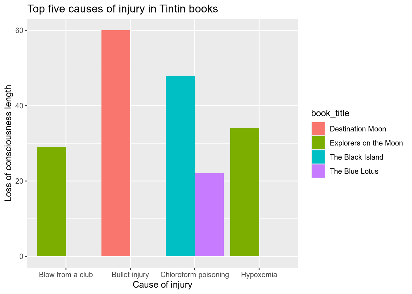
Here’s how to do it with one additional line to the usual ggplot statements.
ggplot(total_head_trauma_5) +
  geom_col(
    aes(
      x = cause_of_injury, y = loss_of_consciousness_length,
      fill = book_title
    ),

    # not this
    # position = "dodge"

    # but this
    position = position_dodge(preserve = "single")
  ) +
  labs(
    x = "Cause of injury", y = "Loss of consciousness length",
    title = "Top five causes of injury in Tintin books"
  )
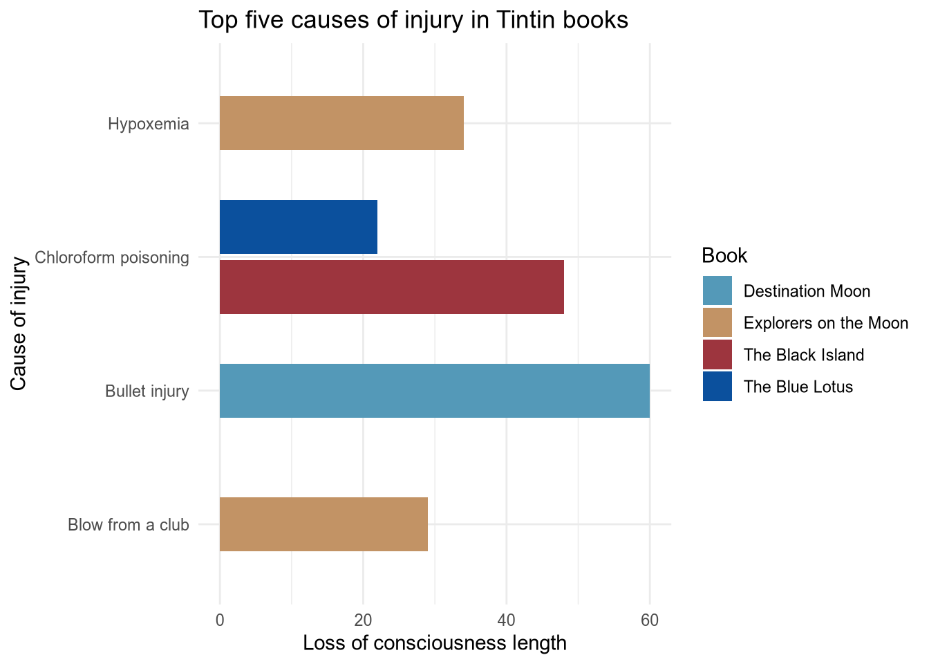
We can center the columns and make columns in the same category more separated, and also make it a bit nicer.
ggplot(total_head_trauma_5) +
  geom_col(
    aes(
      x = cause_of_injury, y = loss_of_consciousness_length,
      fill = book_title
    ),
    position = position_dodge2(preserve = "single")
  ) +
  labs(
    x = "Cause of injury", y = "Loss of consciousness length",
    title = "Top five causes of injury in Tintin books"
  ) +
  theme_minimal() +
  scale_fill_manual(
    values = tintin_colours$the_black_island, name = "Book"
  ) +
  coord_flip()