Updated 2022-05-28: I moved the blog to Quarto, so I had to update the paths.
A friend who doesn’t use the Tidyverse sent me this very nice plot:
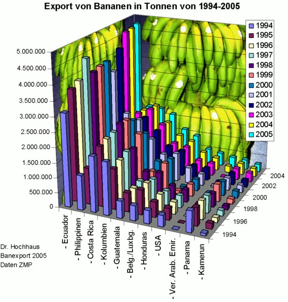
My first intuition to obtain the data for this unidentified plot was to go to FAO, and it was there!
I went to FAO Stat, filtered the countries and years seen in the plot and I got the required inputs to re-express the information.
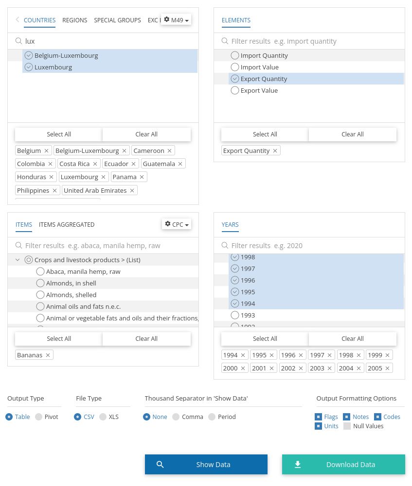
Now it’s time to use the Tidyverse, or at least parts of it. The resulting datasets from the in-browser filters is here.
library(ggplot2)
library(dplyr)
library(forcats)

message(getwd())

bananas <- readr::read_csv("FAOSTAT_data_en_12-21-2022.csv") %>%
  mutate(
    Year2 = fct_relevel(
      substr(Year, 3, 4), c(94:99, paste0("0", 0:5))),
    Area = case_when(
      Area %in% c("Belgium","Luxembourg") ~ "Belgium-Luxembourg",
      TRUE ~ Area
    )
  ) %>%
  group_by(Year2, Area) %>%
  summarise(Value = sum(Value, na.rm = T))

ggplot(bananas) +
  geom_col(aes(x = Year2, y = Value), fill = "#f5e41a") +
  facet_wrap(~ Area, ncol = 3) +
  labs(
    x = "Year",
    y = "Value (tonnes)",
    title = "Export in Bananen in Tonnen von 1994-2005\n(Banana exports in tonnes from 1994-2005)",
    subtitle = "Source: Unidentified"
  ) +
  theme_minimal(base_size = 13) +
  scale_y_continuous(labels = scales::label_number(suffix = " M", scale = 1e-6))
The challenges were:
- Combine Belgium and Luxembourg data into a single area
- Express the axis in millions of tonnes
- Find a right banana yellow for the plot
I hope it’s less cluttered than the original plot!
