library(readr)
library(dplyr)
library(ggplot2)
library(sf)
library(canadamaps)
library(tintin)Plotting a COVID-19 vaccination map with different projections (with updated versions of canadamaps and tintin)
R
Ggplot2
Using a real dataset from Health Canada to show ggplot’s flexibility.
R and Shiny Training: If you find this blog to be interesting, please note that I offer personalized and group-based training sessions that may be reserved through Buy me a Coffee. Additionally, I provide training services in the Spanish language and am available to discuss means by which I may contribute to your Shiny project.
Motivation
I had to fix some dependency problems in canadamaps and I also simplified tintin’s usage (the R package, therefore it’s lowercase). I thought it would be good to show an updated example.
Summary
- canadamaps now needs a specific rmapshaper version (0.4.6) to avoid problems with 0.5.0.
- tintin now allows to write palettes’ names in almost any way (i.e., as “the_palette”, “the palette” or “ThE PaLEttE”).
Combined example
This is an adapted example from canadamaps’ readme.
We start by loading the required packages.
Let’s say I want to replicate the map from Health Canada, which was checked on 2023-08-02 and was updated up to 2023-06-18. To do this, I need to download the CSV file from Health Canada and then combine it with the provinces map from canadamaps.
url <- "https://health-infobase.canada.ca/src/data/covidLive/vaccination-coverage-map.csv"
csv <- gsub(".*/", "", url)
if (!file.exists(csv)) download.file(url, csv)

vaccination <- read_csv(csv) %>%
  filter(week_end == as.Date("2023-06-18"), pruid != 1) %>%
  select(pruid, proptotal_atleast1dose)

vaccination <- vaccination %>%
  left_join(get_provinces(), by = "pruid") %>% # canadamaps in action
  mutate(
    label = paste(gsub(" /.*", "", prname),
                  paste0(proptotal_atleast1dose, "%"), sep = "\n"),
  )
An initial plot can be done with the following code.
# colours obtained with Chromium's inspector
colours <- c("#efefa2", "#c2e699", "#78c679", "#31a354", "#006837")

ggplot(vaccination) +
  geom_sf(aes(fill = proptotal_atleast1dose, geometry = geometry)) +
  geom_sf_label(aes(label = label, geometry = geometry)) +
  scale_fill_gradientn(colours = colours, name = "Cumulative percent") +
  labs(title = "Cumulative percent of the population who have received at least 1 dose of a COVID-19 vaccine") +
  theme_minimal(base_size = 13)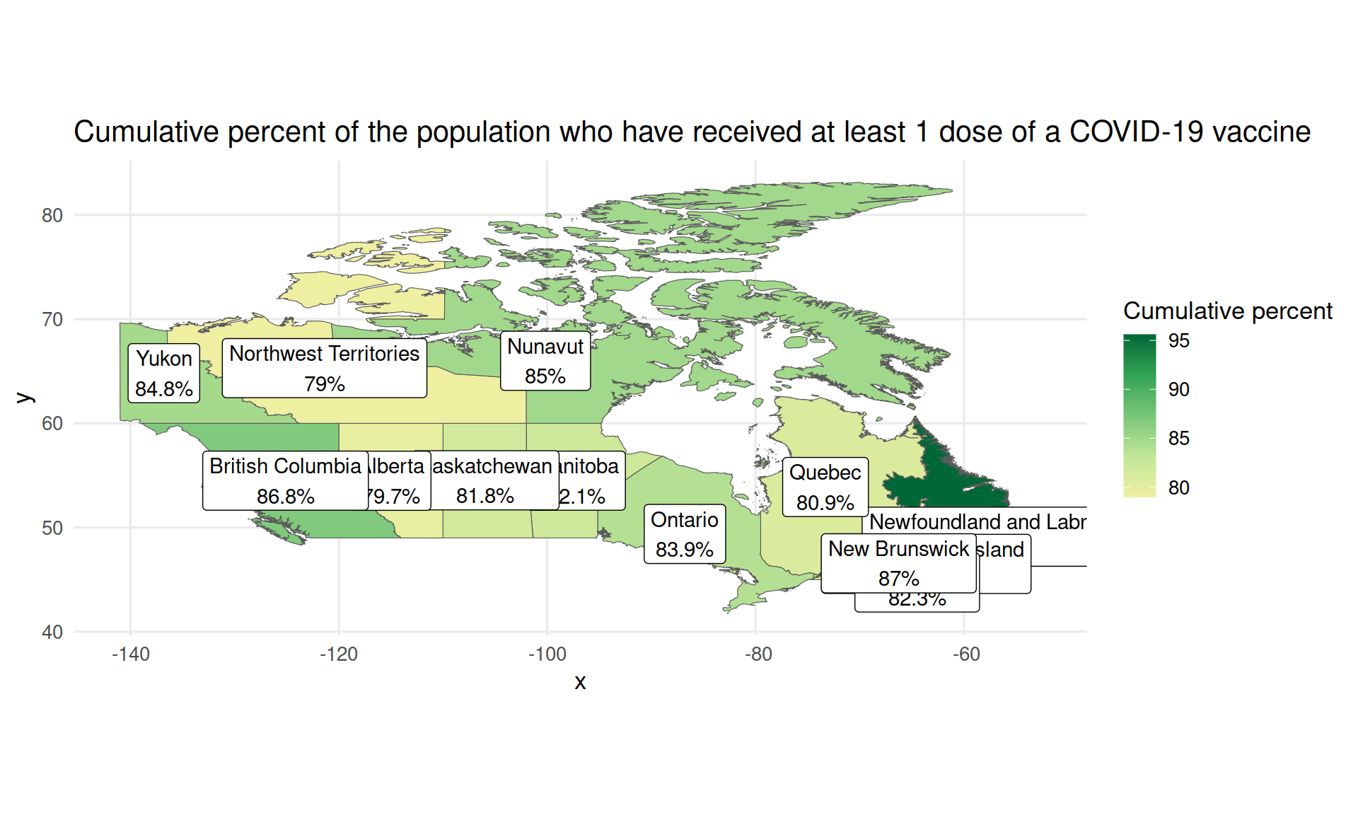
What if we want a Lambert (conic) projection? We can change the CRS with the sf package but please read the explanation from Stats Canada.
vaccination$geometry <- st_transform(vaccination$geometry,
  crs = "+proj=lcc +lat_1=49 +lat_2=77 +lon_0=-91.52 +x_0=0 +y_0=0 +datum=NAD83 +units=m +no_defs")

ggplot(vaccination) +
  geom_sf(aes(fill = proptotal_atleast1dose, geometry = geometry)) +
  geom_sf_label(aes(label = label, geometry = geometry)) +
  scale_fill_gradientn(colours = colours, name = "Cumulative percent") +
  labs(title = "Cumulative percent of the population who have received at least 1 dose of a COVID-19 vaccine") +
  theme_minimal(base_size = 13)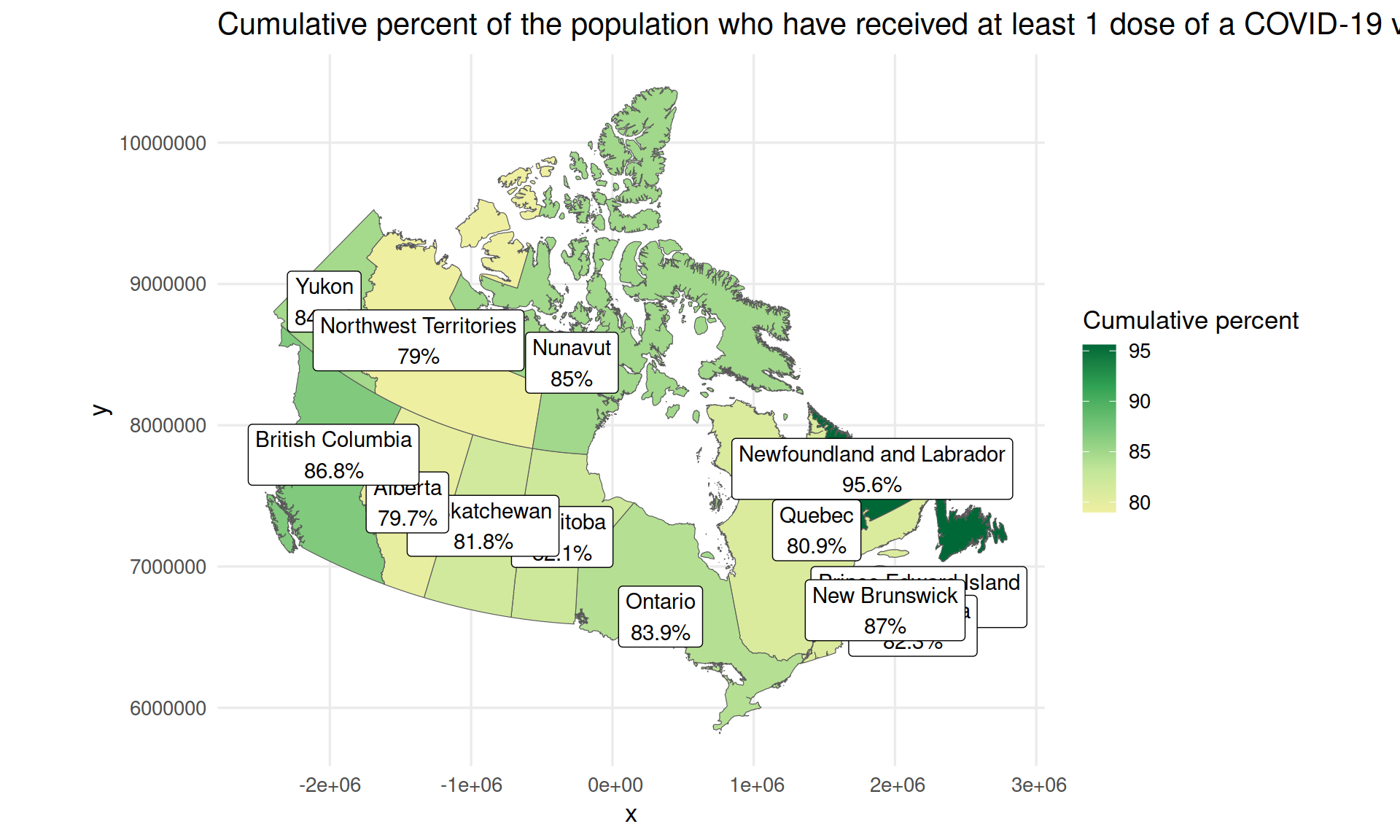
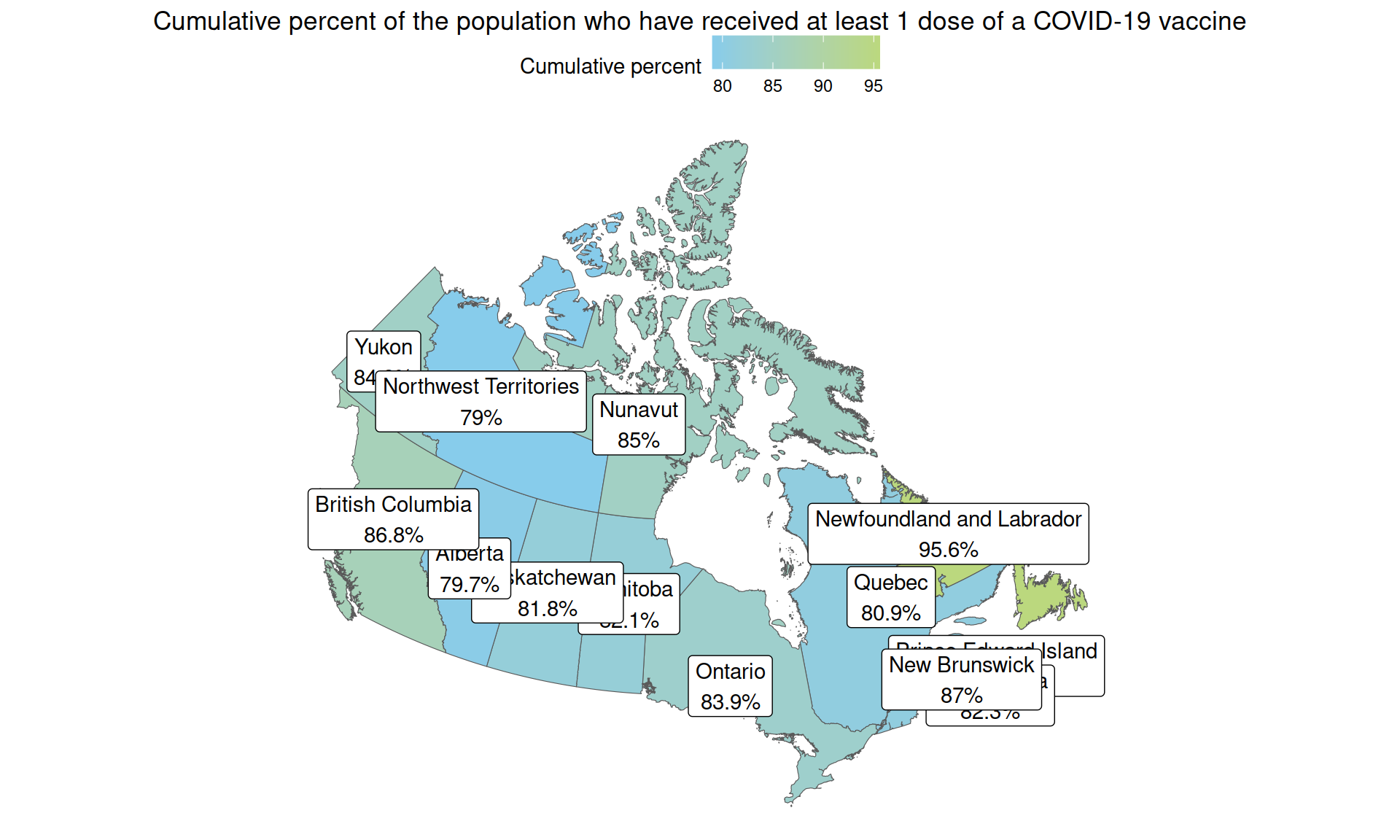
Finally, we can use a different colour scale, in this case the one from “Tintin in America” and a different ggplot theme.
colours <- tintin_clrs(option = "tintin in america")[1:2]

ggplot(vaccination) +
  geom_sf(aes(fill = proptotal_atleast1dose, geometry = geometry)) +
  geom_sf_label(aes(label = label, geometry = geometry)) +
  scale_fill_gradientn(colours = colours, name = "Cumulative percent") +
  labs(title = "Cumulative percent of the population who have received at least 1 dose of a COVID-19 vaccine") +
  theme_void() +
  theme(
    legend.position = "top",
    plot.title = element_text(hjust = 0.5)
  )
Final remark
The pandemic is not over. Please, keep taking care of yourself and others.