# 1. Load libraries

library(dplyr)
library(broom)
library(ggplot2)

# 2. Generate the data

set.seed(1234)

j1 <- data.frame(Group = 1:50,
                 n1 = sample(c(500, 1000, 2500, 5000), 50, TRUE, c(0.1, 0.2, 0.4, 0.3)),
                 n2 = sample(c(200, 400, 500, 1000), 50, TRUE, prob = c(0.3, 0.5, 0.15, 0.05)),
                 m1 = runif(50, -1, 1),
                 m2 = rnorm(50, 5, 0.5),
                 sd1 = sample(c(0.7, 1.5, 2.5), 50, TRUE, prob = c(0.15, 0.5, 0.35)),
                 sd2 = sample(c(0.7, 1, 3.5), 50, TRUE, prob = c(0.05, 0.6, 0.35)))
j2 <- j1 %>%
  group_by(Group) %>%
  do(x = c(rnorm(.$n1, .$m1, .$sd1), rnorm(.$n2, .$m2, .$sd2))) %>%
  tidy(x)

j3 <- j2 %>%
  mutate(GroupNum = rev(as.numeric(Group))) %>%
  group_by(Group, GroupNum) %>%
  do(tidy(density(.$x, n = 100))) %>%
  group_by() %>%
  mutate(ymin = GroupNum * (max(y) / 10), #This constant controls how much overlap between groups there is
         ymax = y + ymin)

j4 <- j3 %>%
  group_by(Group, GroupNum) %>%
  do(data.frame(approx(.$x, .$ymax, xout = seq(min(j3$x), max(j3$x), length.out = 250)))) %>%
  mutate(y = ifelse(is.na(y), j3$ymin[j3$Group == Group][1], y),
         ymin = j3$ymin[j3$Group == Group][1],
         ymaxN = y + rnorm(n(), 0.001, 0.005)) %>%
  arrange(x) %>%
  mutate(ymaxN = ifelse(row_number() %in% c(1, n()), ymin + min(ymaxN - ymin), ymaxN))

j4$ymaxS <- smooth(j4$ymaxN, kind = "S", endrule = "copy", do.ends = FALSE)

# 3. Export to png

png(filename = "img/joy_division.png", width = 1680, height = 1050, bg = "black")
p <- ggplot()
for (i in rev(unique(j4$GroupNum))) {
  p <- p + geom_ribbon(data = j4[j4$GroupNum == i,], aes(x = x, ymin = ymin + min(j4$ymaxN - j4$ymin), ymax = ymaxS, group = GroupNum), colour = "#F0F0F0", fill = "black") +
    geom_hline(yintercept = j4$ymin[j4$GroupNum == i][1] + min(j4$ymaxN - j4$ymin), colour = "#000000")
}
p <- p +
  coord_fixed(13) +
  theme(panel.grid = element_blank(),
        panel.background = element_rect(fill = "#000000"),
        plot.background = element_rect(fill = "#000000", size = 0),
        axis.text = element_blank(),
        axis.ticks = element_blank(),
        axis.title = element_blank())
p
dev.off()Joy Division’s Unknown PleasuRes
R
Ggplot2
I wanted to create a wallpaper and here’s how I solved white borders and some difficulties.
Updated 2022-05-28: I moved the blog to Quarto, so I had to update the paths.
Introduction
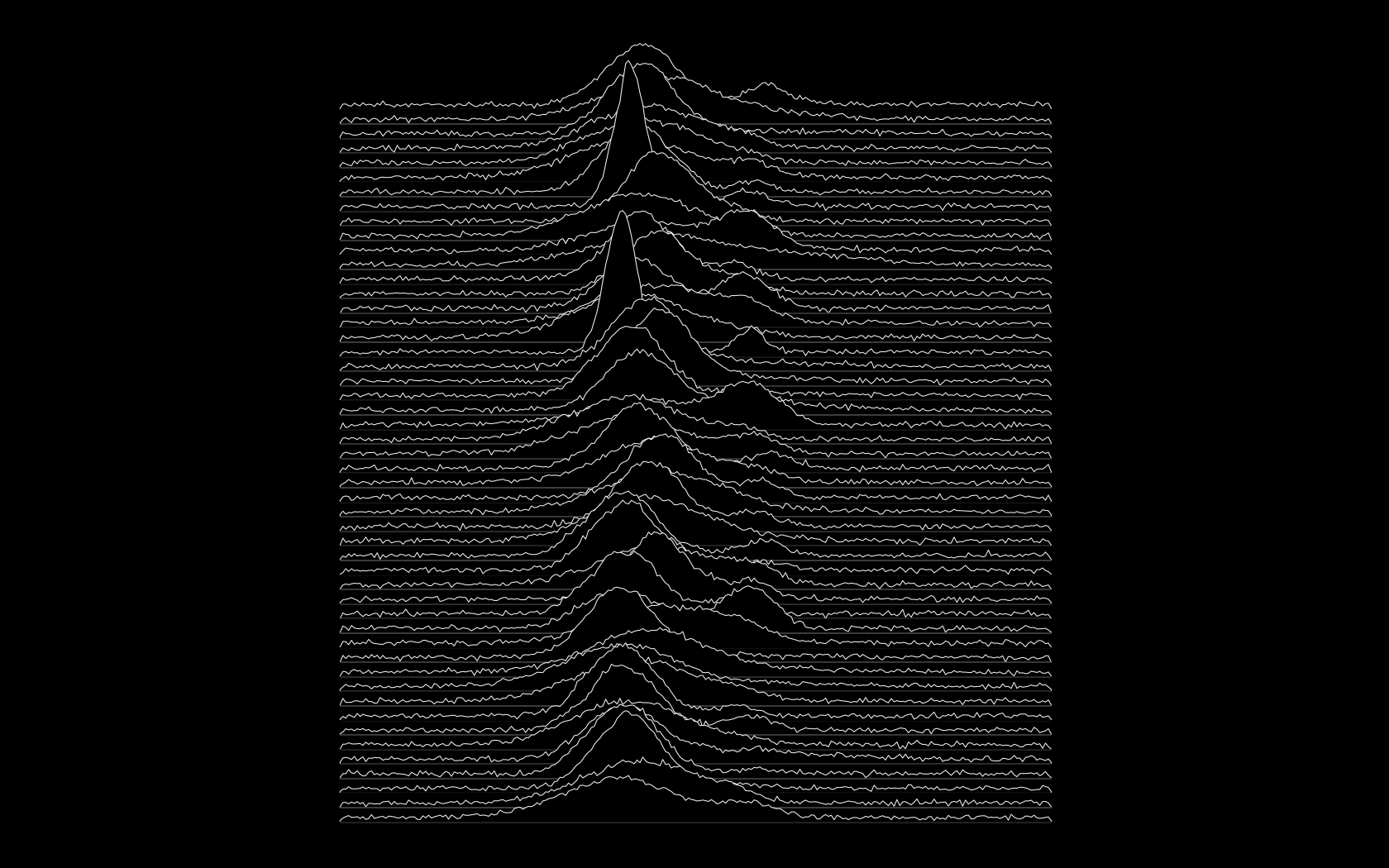
Who knew Joy Division had a penchant for data visualization? there is an interesting story about Unknown Pleasures.
Alex Whan previously posted some instructions on how to obtain the most influential Post-Punk front cover using ggplot2.
Code
I wanted to create a wallpaper from that and here’s how I solved white borders and some difficulties.
Final result